
Excuse the not so good quality of my scanner, but here are some random pages from my sketchbook:
(make sure you check out the older entries, they get pushed down as I post new things unfortunately!)
Excuse the not so good quality of my scanner, but here are some random pages from my sketchbook:
(make sure you check out the older entries, they get pushed down as I post new things unfortunately!)


This is a piece that I found by chance looking for something else on my hard drive. Brought me back to the old times(year two in university). So here’s to old times sake, a typographic layout for a song that was chosen for us. Mine was, Sarah Mclaughlin – Angel. I guess I’ll be adding more things from the past as I come across them in the future.

This logo is designed to reflect attributes of stability, synonymous of insurance services in general, and the insurance services provided by the Yarmouk Insurance Company in particular. The font is reflective of a type of calligraphy, written in reversal to give a mirroring effect. The calligraphy was chosen to give the logo a traditional authentic feel, while the mirroring effect was chosen to make the traits of wholeness, and continuity, true of the Company’s services, stand out. The text flows to the boarder of the logo space thus highlighting the attribute of comprehensiveness further, and the color schemes chosen for this piece incorporate shades of blue. The blue color reflects a calm and stable corporate feel, while the logo itself is designed to give a strong and powerful presence.

Filed under Yarmouk Insurance
Designed and aimed at the kids and their parents who shop at Hamleys. This fun little card emulates a gift box that is empty. That’s why every kid who walks into the store is required to send Santa a letter asking him for their Christmas wishes! The card then is mailed back to the kid’s parents, and in turn will hopefully come back to Hamleys for that secret Christmas wish.


Here is another Flowing Line campaign product, this time, aimed at Ambassadors’ Wives to invite them to the showroom.


Filed under Jordan River Foundation
The Flowing Line, a campaign designed by my boss at the time in Wunderman, was the main visual for the Jordan River Foundation promotional material for 2009. I designed many pieces for this campaign, and this was one of the invites I created.
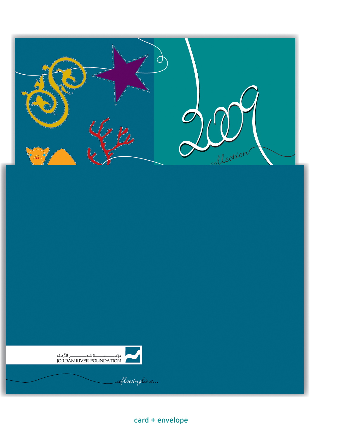


Filed under Jordan River Foundation
Finally, a reason to study more. With the new Microsoft Home and Student, homework has become easier and much more fun. This project is an extension of the Dubai Microsoft Home and Student campaign. I designed banners, roll-up banners, ads, flyers, and vouchers to market this Microsoft launch.


Filed under Microsoft
A corporate Microsoft card wishing its loyal clientele a Happy Eid with Microsoft for the year of 2009! Have a new vision with Microsoft.


Here are two tissue paper packs in which I designed for Nuqol Fine Paper Products. Fun, colorful, and cheerful is what Easter is about!


Filed under Nuqol Fine
This wine menu was designed for Nader Group. They wanted to deliver their imported fine wines into two respectable restaurants in Jordan: Centro and Esaki. Driven by label art, this wine menu plays on the idea of the different kinds of wines throughout the menu. The pattern, drawn and put together from scratch, was made to showcase the organic, green, raw and fluid characteristic of the wine.


Filed under Nader Group
